

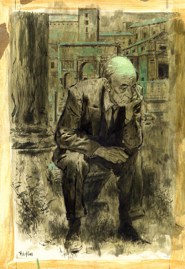
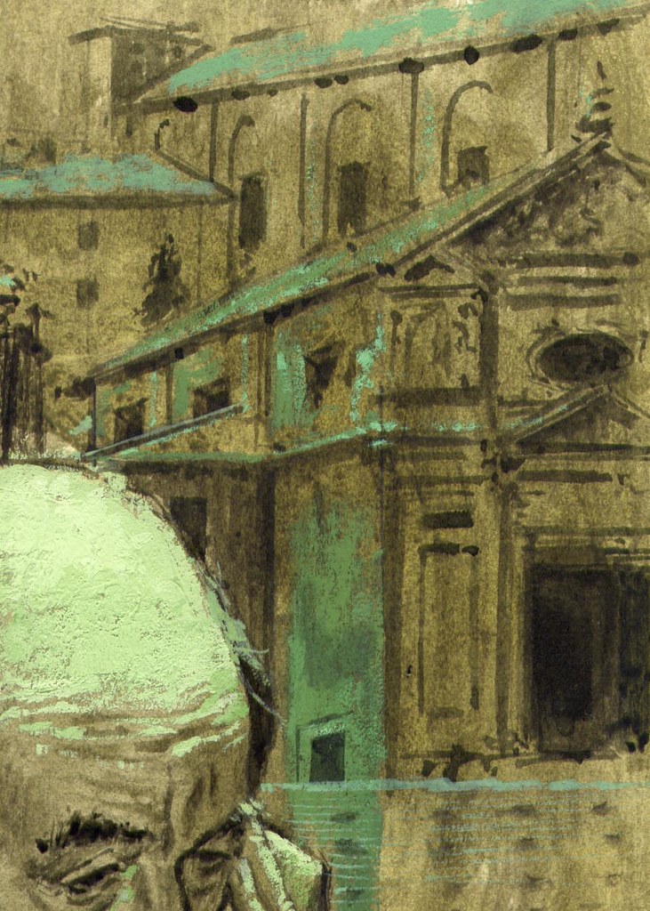
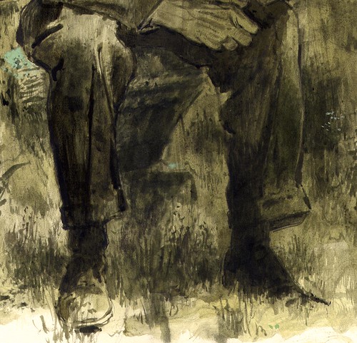
The artwork looks like it was done in ink wash, tinted slightly green, on illustration board. Stone then came in on top with white gouache - again tinted green - for the highlights and some of the background elements, creating a nice cohesion between foreground and background.
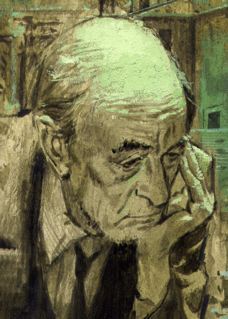
The over all effect is really nice! Stone brought just enough detail and accuracy to the architecture to create a sense of solidity and authenticity, without distracting the viewer from the focal point - his elderly subject.
The way Stone allows elements of the figure to drop away into shadow and others to fade away into light is also really effective. Nothing is belaboured. The artist understood that nonessential details would only distract from the mood and composition of the piece.
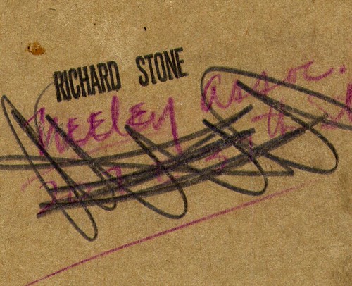
Walt Reed's Illustrator in America tells us that Dick Stone was "affiliated with Neeley Associates" (I presume that Neeley Associates was an art studio or art representative) and the reverse of the illustration board confirms this piece was created during that period in the artist's career.
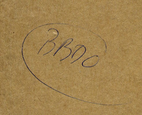
Another interesting clue: The ad agency name,'BBD&O' is also written on the back -- so perhaps this piece was done for advertising - not a story illustration as one would at first assume.
I've been a fan of Dick Stone's work since I first came across it in Collier's magazine. Since then, I've located several more nice examples of his work in a variety of publications. This week, let's take a look at this extraordinary artist.
*My Dick Stone original came from Mitch Itkowitz's Graphic Collectibles website, where you'll find several more illustrations by the artist ( though I think I got the best one ). Mitch's site is a treasure trove of beautiful original art, most of which is out of my price range - but I must say, if you're in the market for a nice piece of original art, the Dick Stone originals Mitch has available are a steal.
My Dick Stone Flickr set.


0 Yorumlar